Queen Sonja Singning Competiton
— Visual Identity Redesign
project
The objective with this redesign, as breifed by Queen Sonja Singing Competition, was to create a new visual identity that could appeal to a younger audience, as they were branching out from being opera focused to include singing overall. As a highly regarded singing competition, their vision was to bring the power of human voices out to the modern world.
Design Concept
We wanted to create a visual identity with a strong and bold modern expression, highlighting the power of human voices and the dramatic nature of opera music. The identity concept builds around the aspect of soundwaves, and features wavy patterns inspired by real opera songs. Colors are used as important visual elements, providing the identity with recognizability and a captivating visual expression.
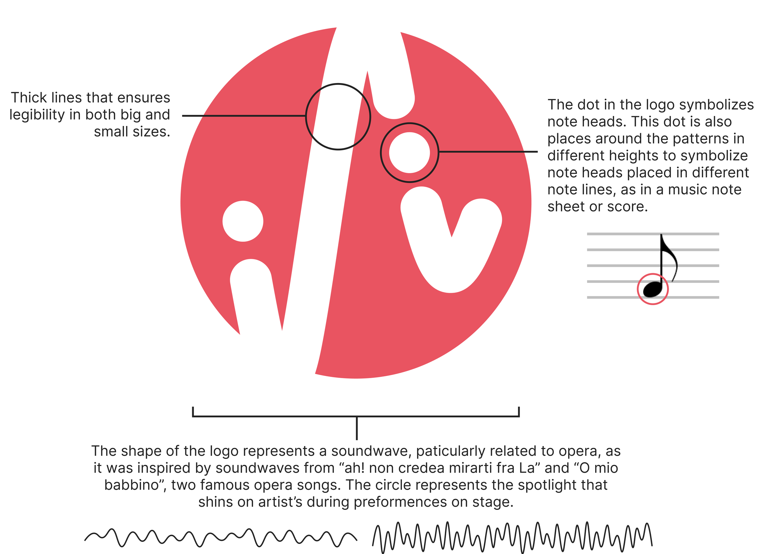
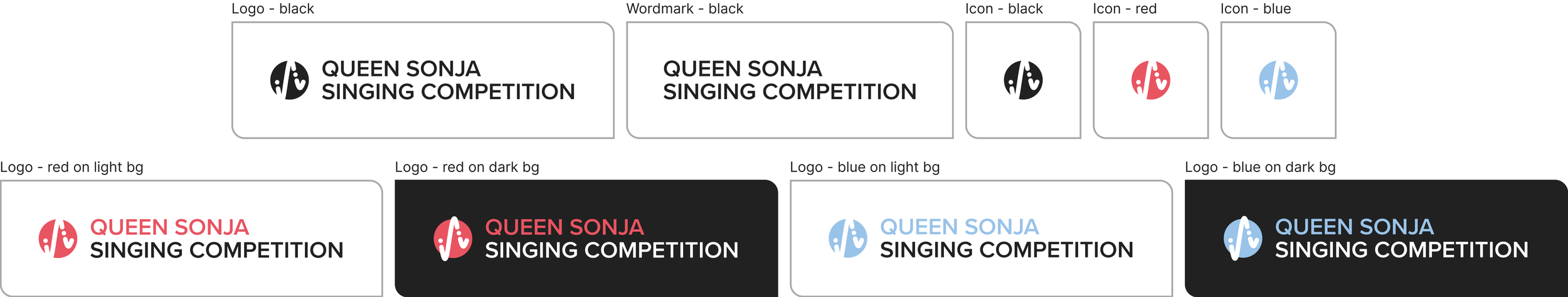
LOGO
Following the concept of soundwaves, the logo icon feature a wave with two dots. These dots represent note heads, placed at different heights to represent the different notes in a music note score. The circle encasing the logo represent the spotlight, which shines on the artist during preformences, colored in dramatic red to highlight the artists power through their voice.
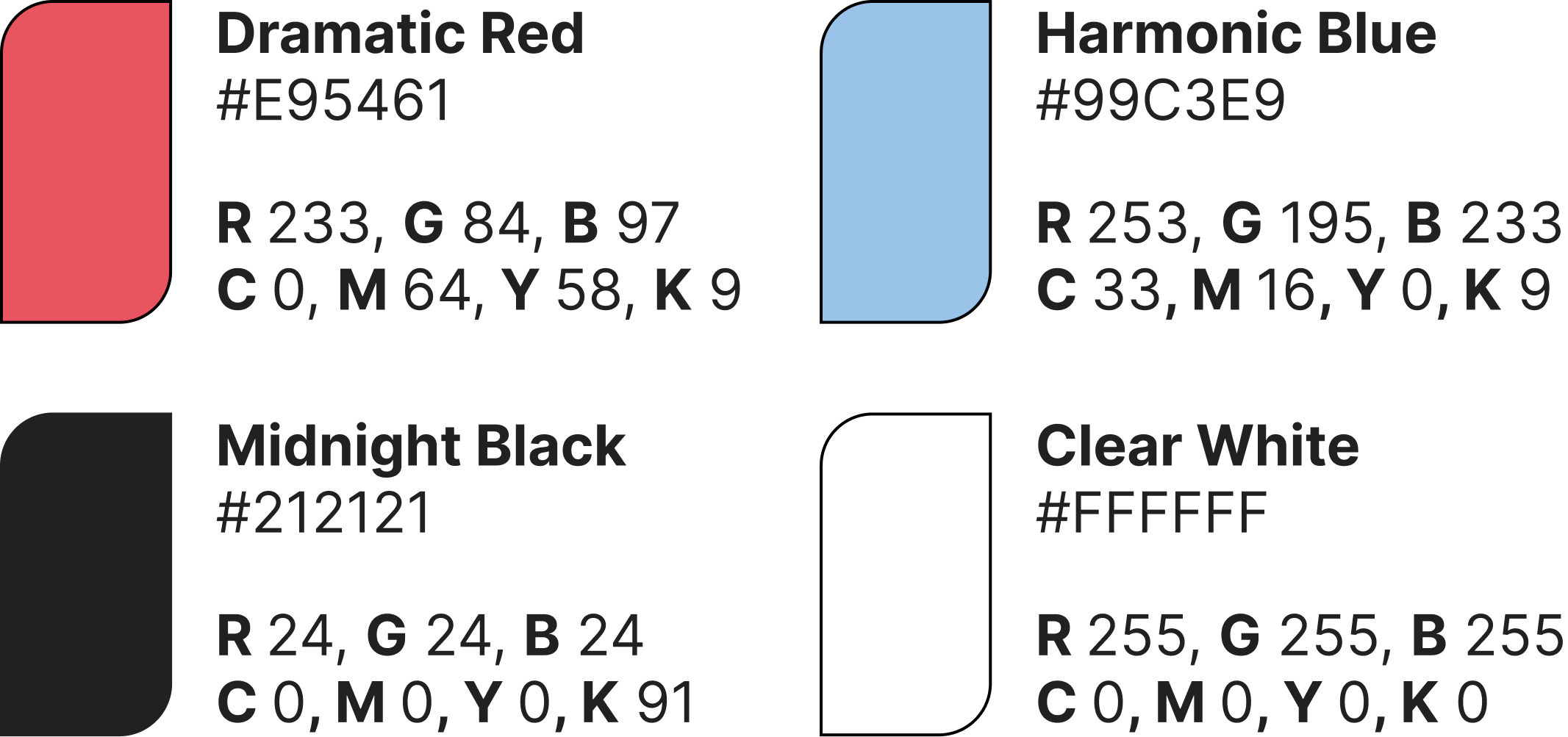
COLOR PALETTE
The identity feature strong and bold colors, which provides a modern expressiosn which appeal to younger audiences. The palette consist of two main identity colors, dramatic red and harmonic blue, which provides the identity with visual balance through warm and color color contrasts. These two indentity colors also represent a singers vocal range, where red reflects the powerfull high notes and the blue reflects the soft low notes.
LOGO DEVELOPMENT
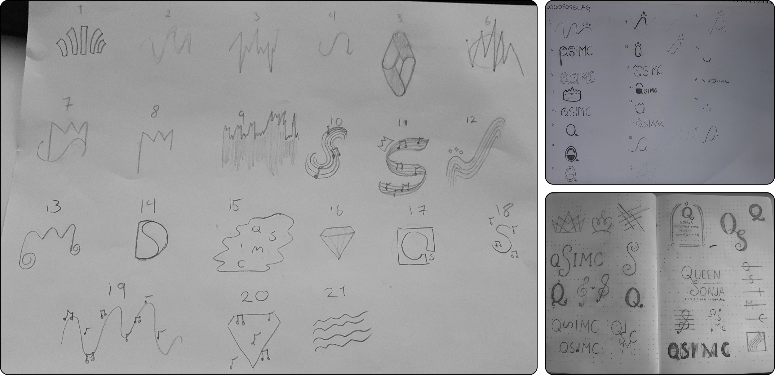
When exploring design directions and concepts, we started by sketching a bunch of logos, with a focus on different concepts, styles and shapes. Through this, we established a vast amounts of concepts and directions, and after voting, we decided to go with the concept of soundwaves.
design iterations
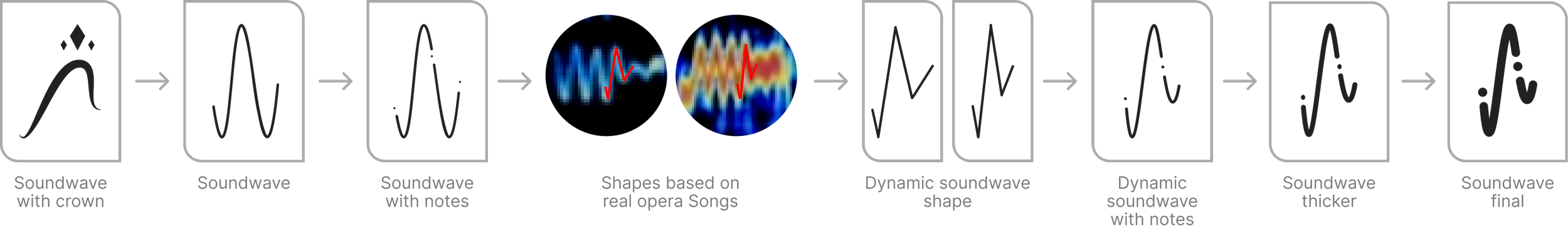
The first sketch feature a wave with a crown, meant to reflect the competitions name and host, beingthe queen of norway. Further iterations played more into the wave shape, adding dots in the line path to symbolize the different notes in a notes sheet. To further this concept, soundwaves from two real opera songs were used to map a more dynamic shape for the soundwave. Using this new dynamic shape, dots were again added to symbolize notes in a music notes sheet, and lines were thickend for legibility
Final designs
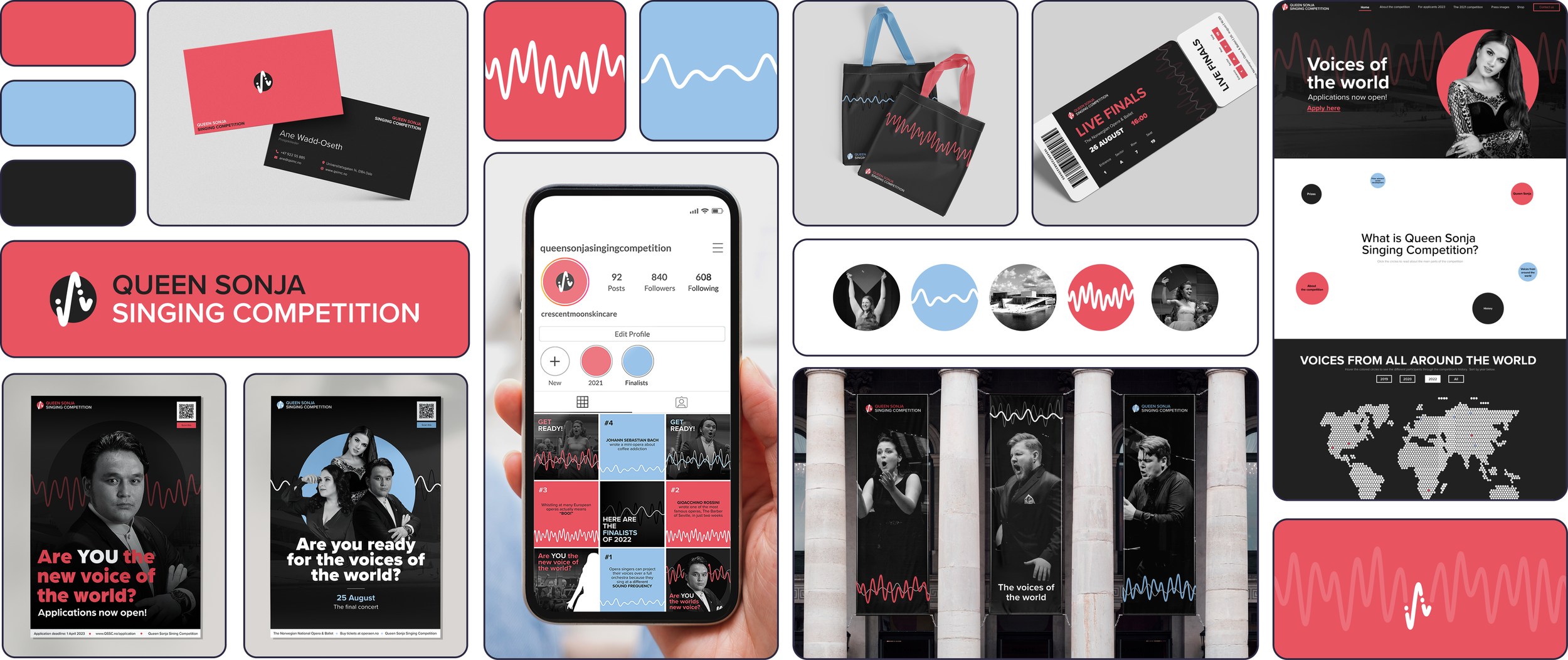
In this project, we were tasked with creating graphics and designs for a varity of different formats and media. The following images showcase the different final desings made for this visual identity across different media and formats, including both print and digital media.
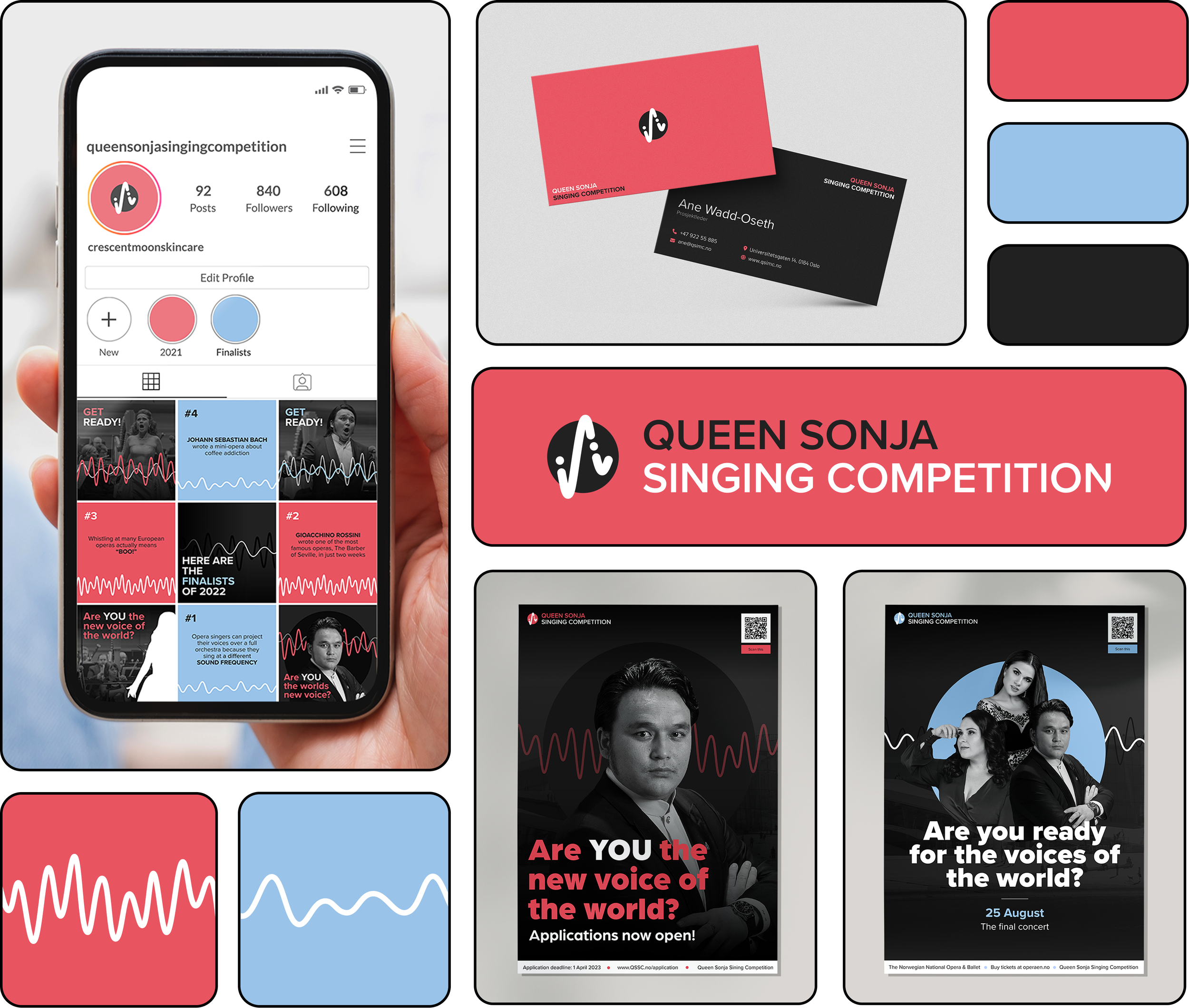
Posters
Two poster designs were created to advertise the competition in physical spaces: one aimed at participants and displayed before and during auditions, and another aimed at audiences, displayed ahead of the event to promote the competition and attract attendees.
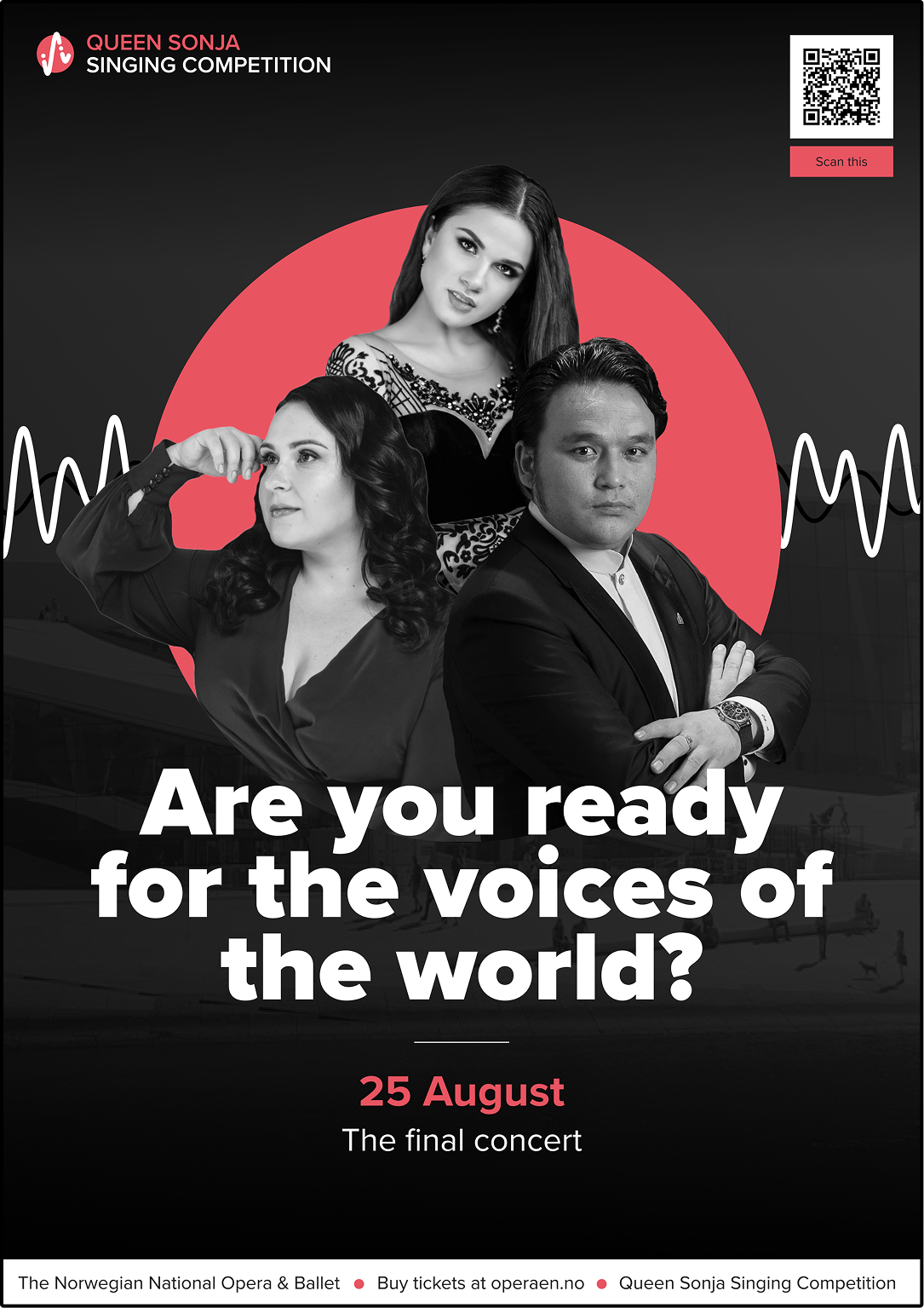
Posters directed at the audience- made to advertise the singing competition in real world environments.
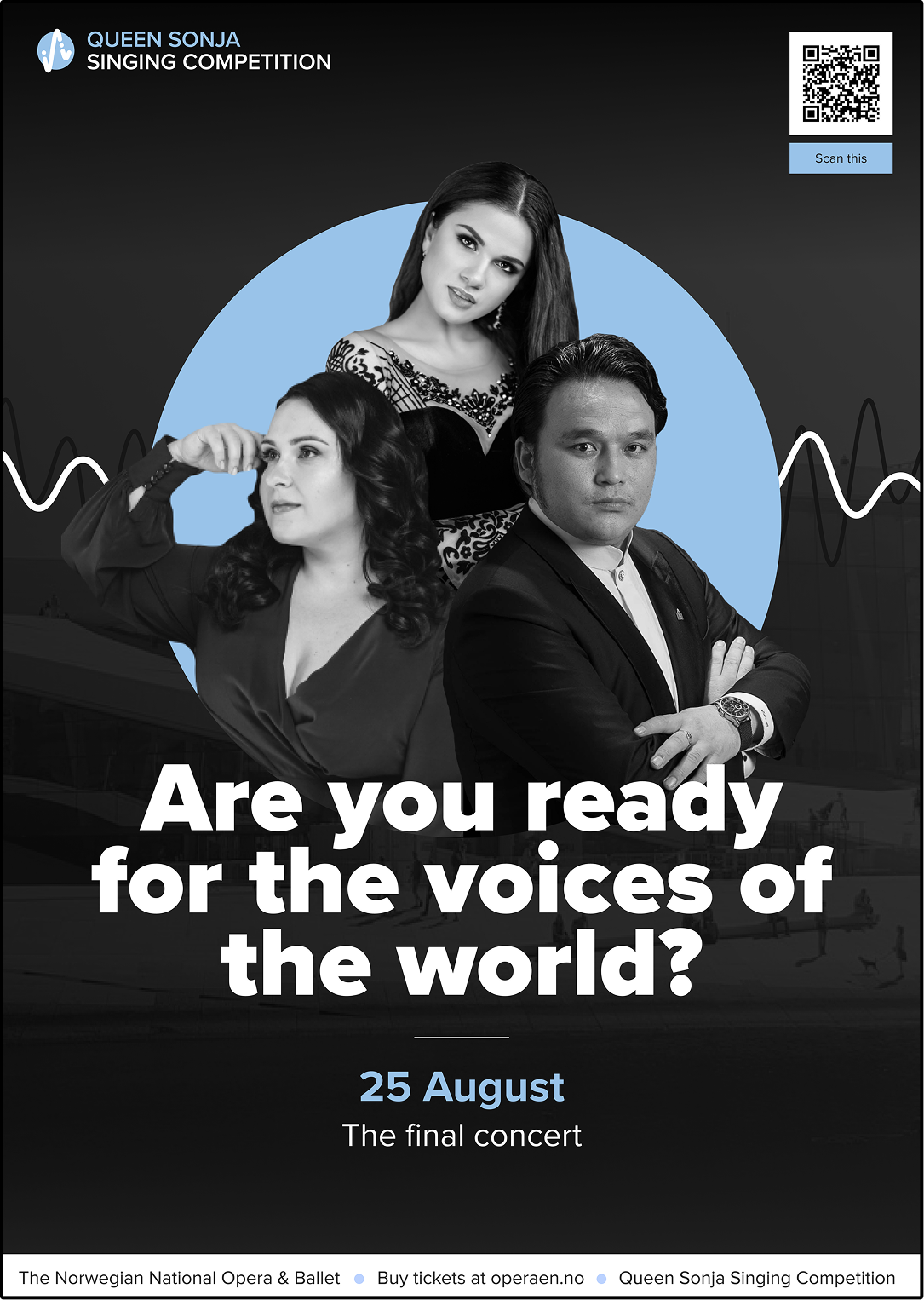
Posters directed at the audience- made to advertise the singing competition in real world environments.
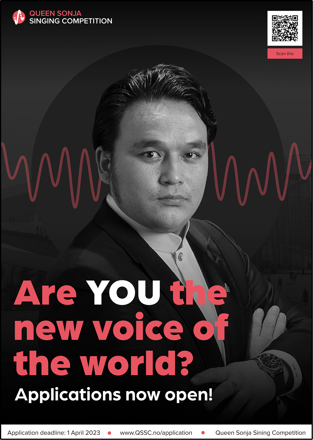
Posters directed at participants- made to advertise the singing competition in real world environments.
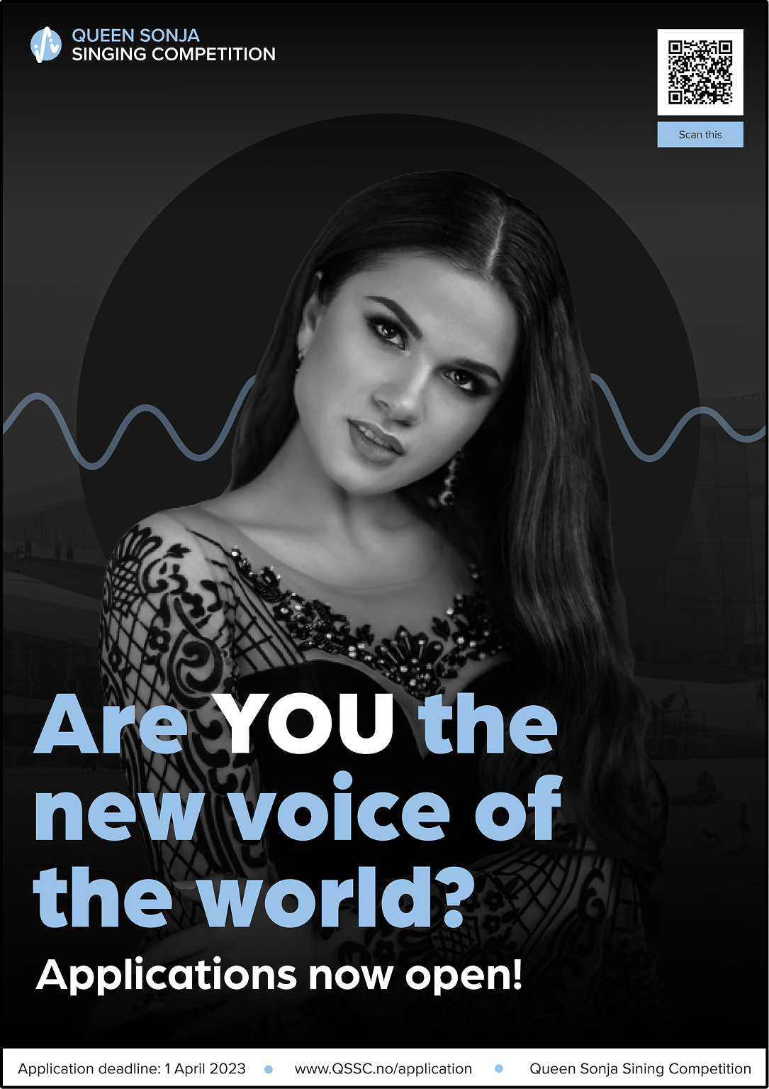
Posters directed at participants- made to advertise the singing competition in real world environments.
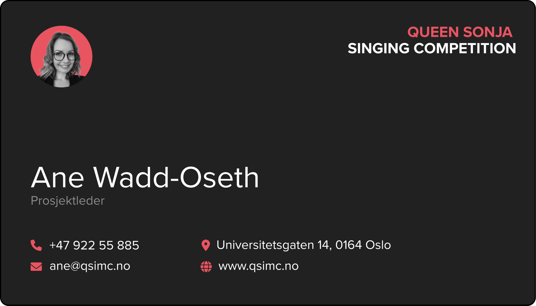
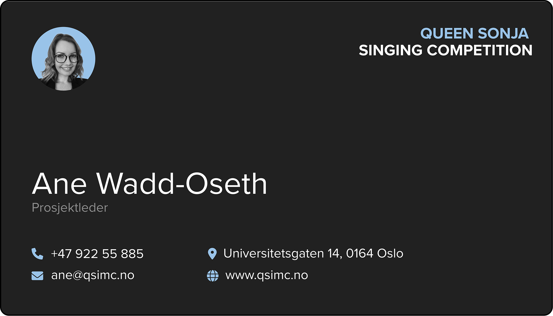
Business cards
Two designes of the business card were made to reflect different relationships to the competition: the red cards are intended for those closely involved in the event, while the blue cards are for more external contacts such as sponsors and partners.
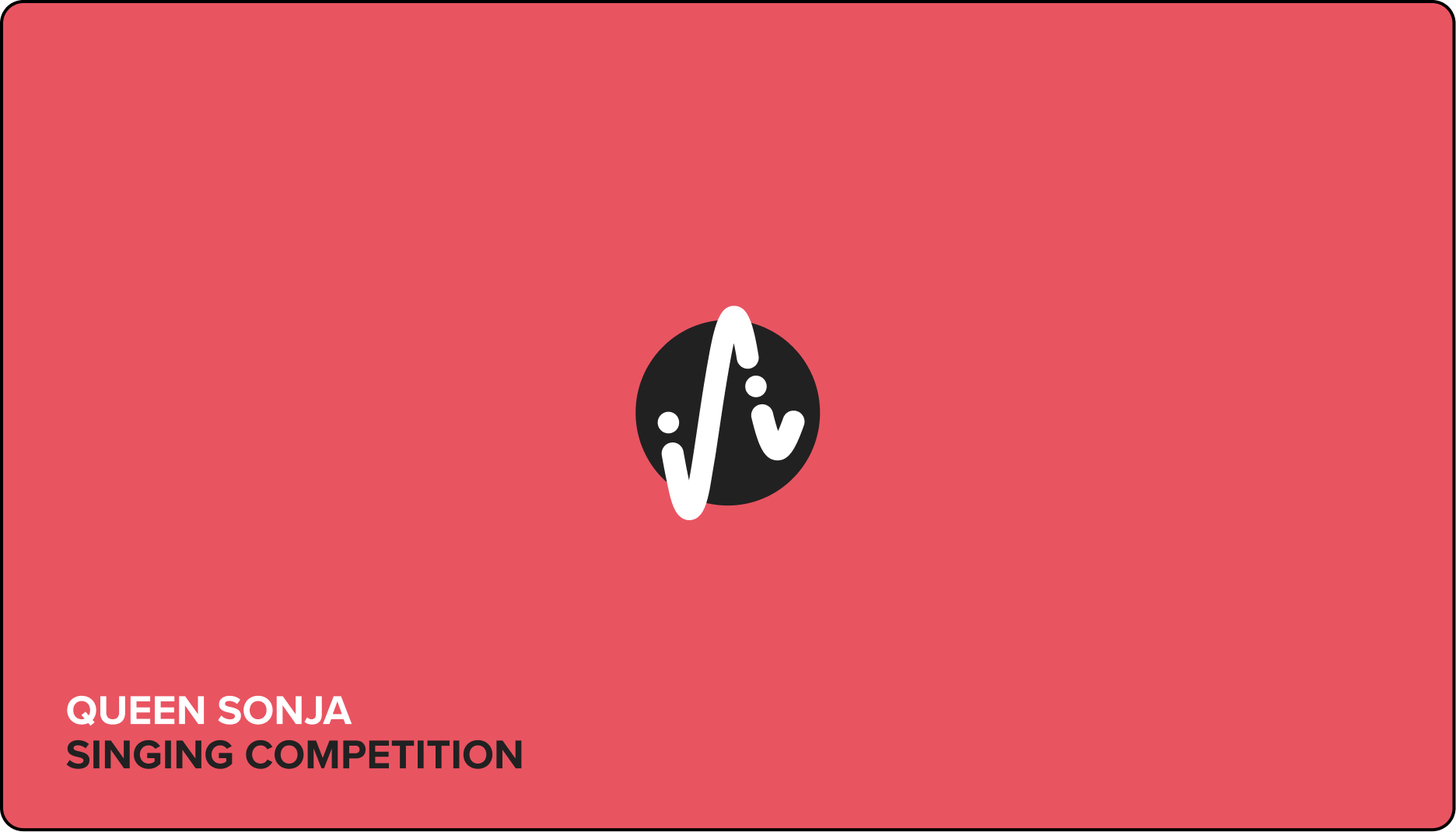
In dramatic red, intended for those closely involved in the event.
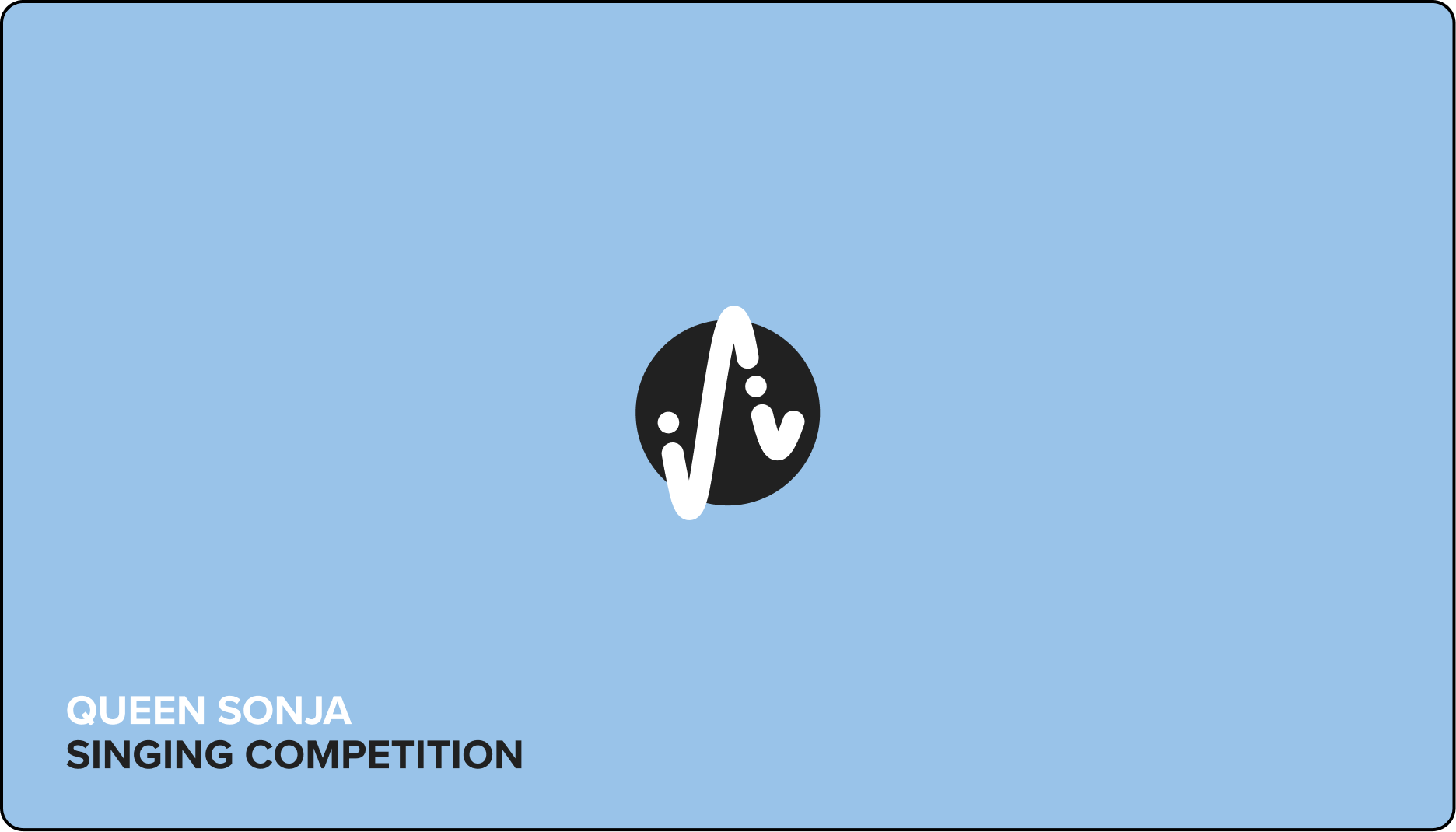
In harmonic blue, intended for more external contacts such as sponsors and partners.
Social media
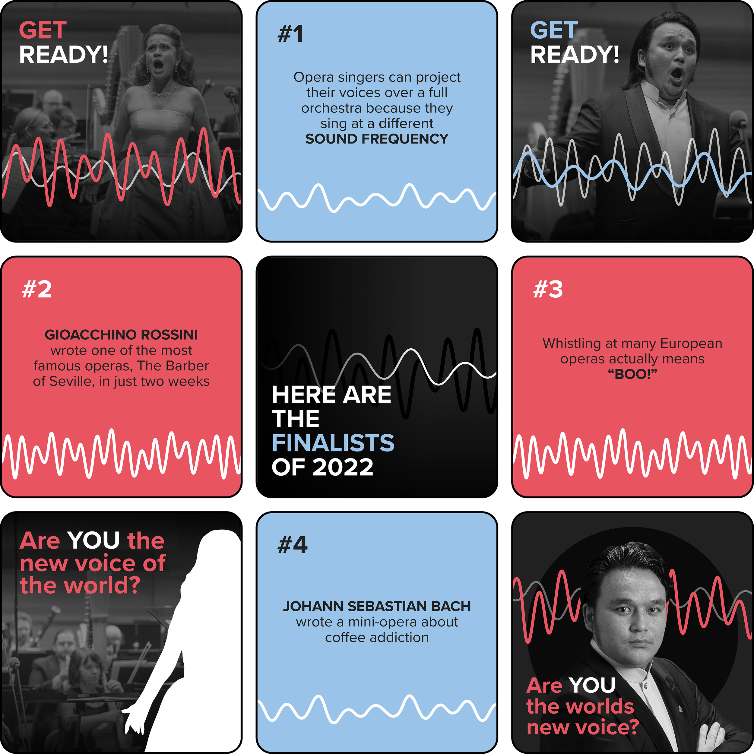
A series of social media graphics was also created for the competition’s Instagram page, including both standalone posts and posts designed to be shared as cohesive multi-image series.
A collection of graphics made for the competitions Instagram page
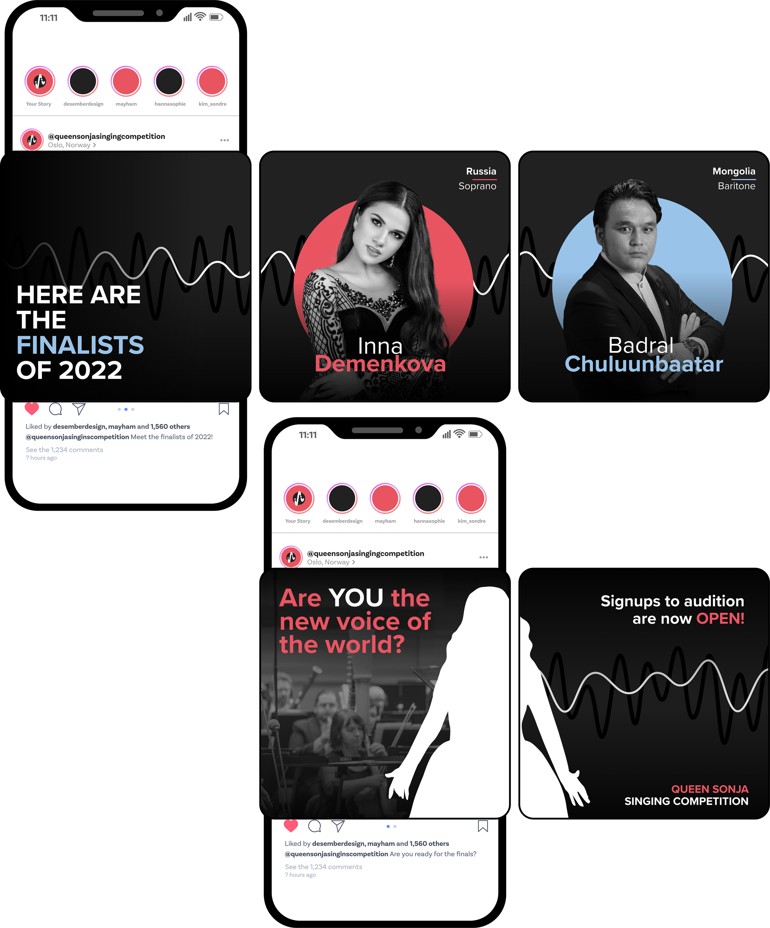
Graphics meant to be posted as a scrollable slideshow
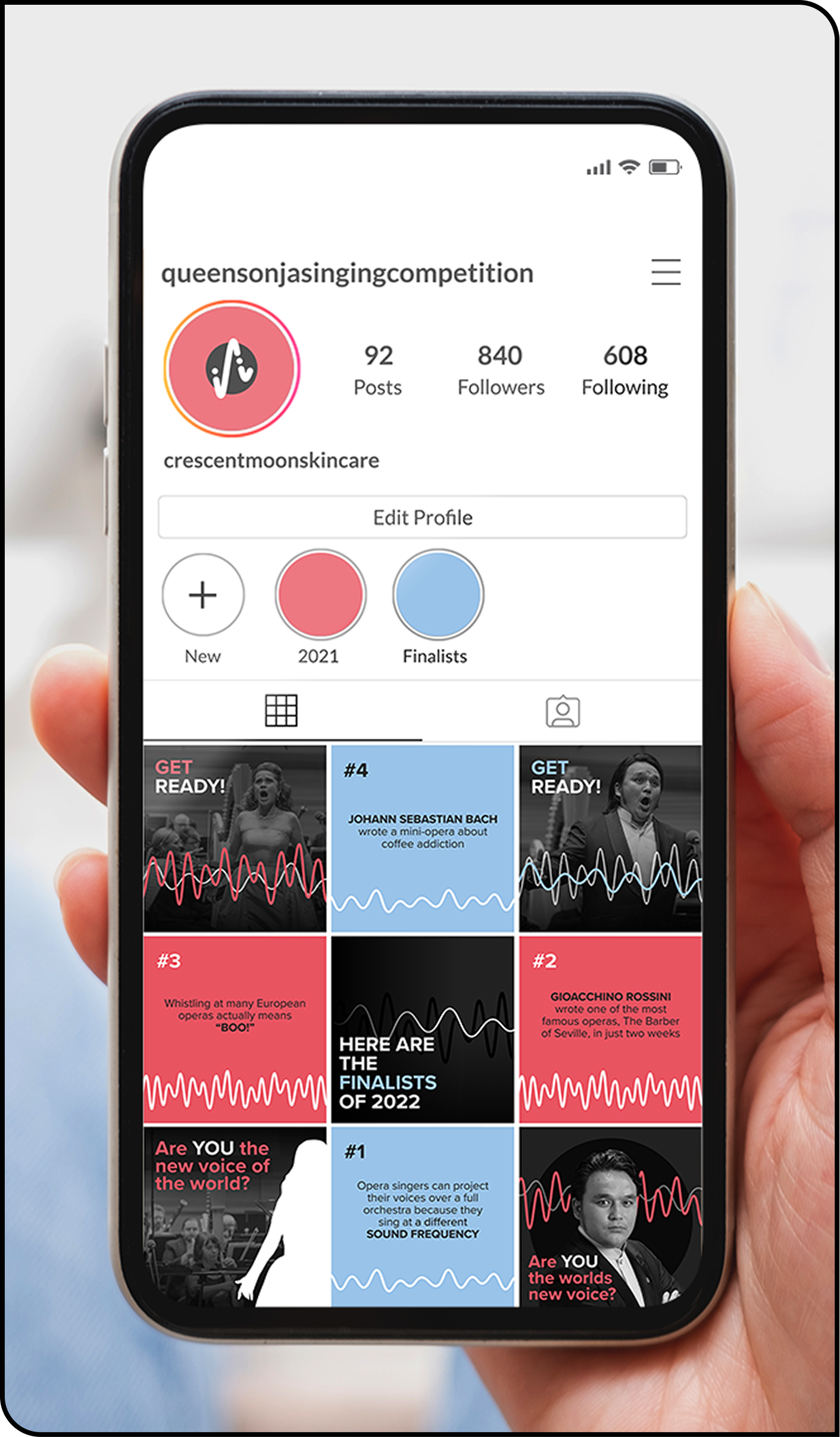
Mockup of the competitions Instagram page
Banner
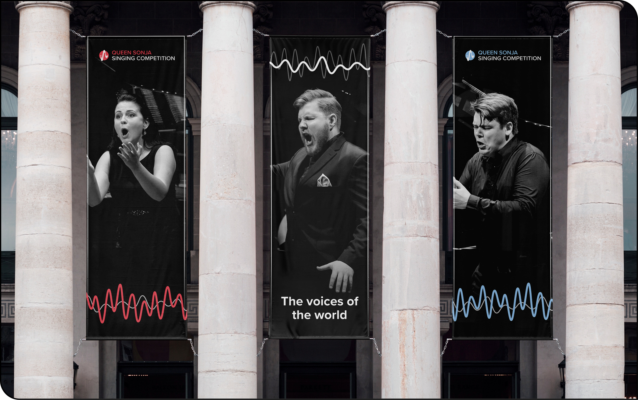
A three-section banner was designed to hang outside the venue, serving both as pre-event advertising and as on-site signage during the competition, as well as being displayed around the city to promote the event.
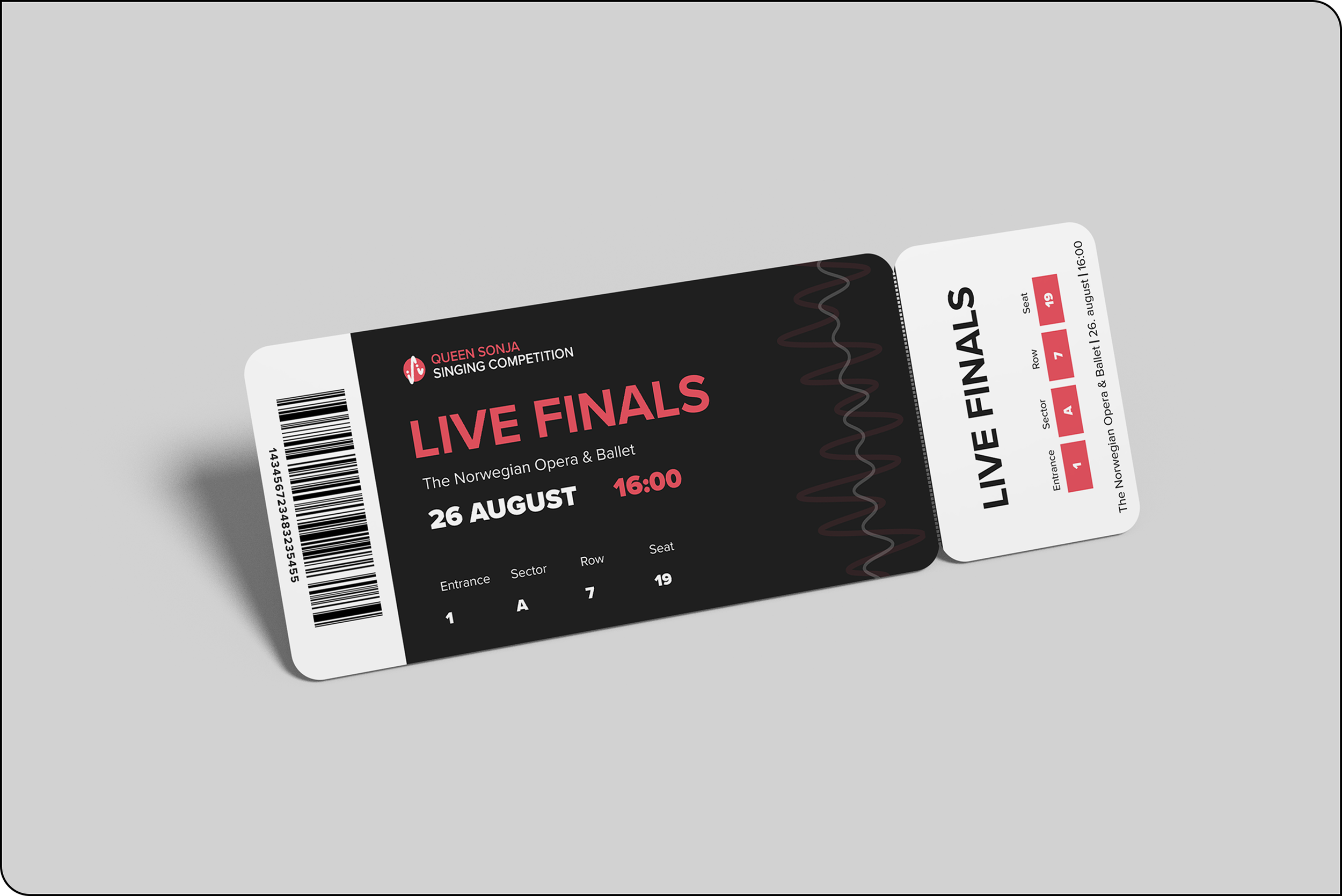
TICKET DESIGN
A ticket design was created for audience members, aligning with the competition’s visual identity while clearly communicating essential event information and enhancing the overall attendee experience.