Norwegian University of Science and Technology (NTNU)
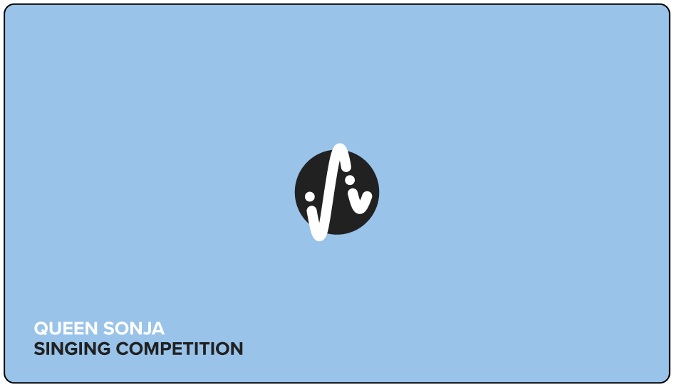
QUEEN SONJA
SINGING COMPETITION
Study Project
Logo & Visual Identity Design
Project Partners
Maja Hansen Moe & Pia Thorshaug
Software
Figma, Adobe Photoshop, & Adobe Illustrator
Year
2022

PROJECT
This project was a collaborative group project focused on developing a new visual identity for the international singing competition, Queen Sonja International Music Competition.
Project Breif
This project was a collaborative group project, as part of the course IDG2015 Strategic Design, focused on developing a new visual identity for the Queen Sonja International Music Competition. This involved designing a new visual identity to be implemented across various touchpoints, such as a website, business cards, posters, and more.
Previously, the competition was named “Queen Sonja International Opera Competition”, and heavily focused on opera music. To branch out and get further reach, the competition was recently renamed to “Queen Sonja International Music Competition”, allowing singers of all kinds the opportunity to compete and preform on their international stage. With this, we were strongly advised to further adjust the competition name as we saw best fit.
The Brand
The Queen Sonja International Music Competition is a prestigious biennial event held in Oslo for singers from around the world. Its mission is to support young vocalists by offering international exposure and acting as a gateway to professional careers in music, while also connecting Norwegian and international music communities.
Ideals
Mission
The following mission statements were emphasized in the development of this visual identity: (1) Identify the best young singers from around the world, (2) Give all participants international exposure, (3) Inspire and enrich the lives of its audiences through exceptional performances and exposure to the power of the human voice, (4) Engage with streaming services to reach hundreds of thousands of people worldwide.
Vision
Their vision revolves around being a world-renowned, leading international singing competition that transforms the careers of young singers, bringing the power of the human voice to the modern world.
Values
The following four key values were identified in our research: (1) the transformative impact of human voices, (2) partnership, (3) leadership, (4) increase visibility.
OUR SOLUTION
The objective with our new visual identity, was to create a design that could appeal to a younger audience, while still resonating with the existing opera interested audience. As their vision was to bring the power of human voices to the modern world, we wanted to create a design with a strong modern expression, utilizing strong colors and bold typography with captivating visual elements.
Our new visual identity has a strong and bold modern expression, highlighting the power of human voices and bridging it with the dramatic nature of opera music. The design build on the concept of sound waves, and features wavy patterns inspired by real opera songs. The identity colors are an important visual element that provides the identity with both a captivating visual expression and strong recognizability, building up the drama and power of strong human voices.
”Voices of the world” was established as the competitions slogan, encompassing the essence of the competitions ideals.
Design Concept
Target Audience
The competitions existing audience contained people of older age groups, especially those with interest in opera. For our new visual identity, we wanted to further the competitions reach, branching further than just opera, and target a younger audience.
Our target audience therefor includes both younger and older viewers, those already interested in opera and those who are not. The visual identity places particular emphasis on engaging the “uninterested,” with the goal of making the competition accessible and appealing to people without a strong connection to opera, while still resonating with the existing opera interested audience.
Participants: Young singers aged 18–32 of all kinds of musical genres
Audience: A broad age range, with a stronger focus on future generations
Interests: Both those already engaged with opera, and those less familiar
LOGO AND CONCEPT DEVELOPMENT
To establish the design direction and overall identity concept, we stared by exploring logo designs. Through this, a strong concept was established, laying the groundwork for further development of the overall visual identity and its key visuals.
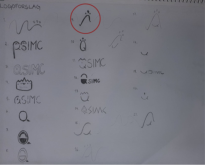
Logo Sketching
When exploring design directions and concepts, we started by sketching a bunch of logos, with a focus on different concepts, styles, and shapes. Vast amounts of logos were sketched between the three project members, and through dot voting, we located three designs that we wanted to explore further.
Digitalizing
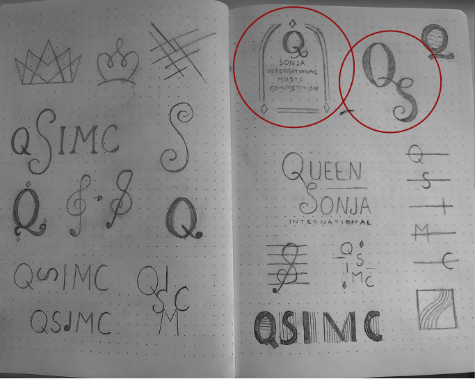
The three chosen logos were further digitalized in Adobe Illustrator. Each concept came attached with a concept, which is described below. However, only one of these concepts were chosen for further exploration, being concept 1.

Concept 1
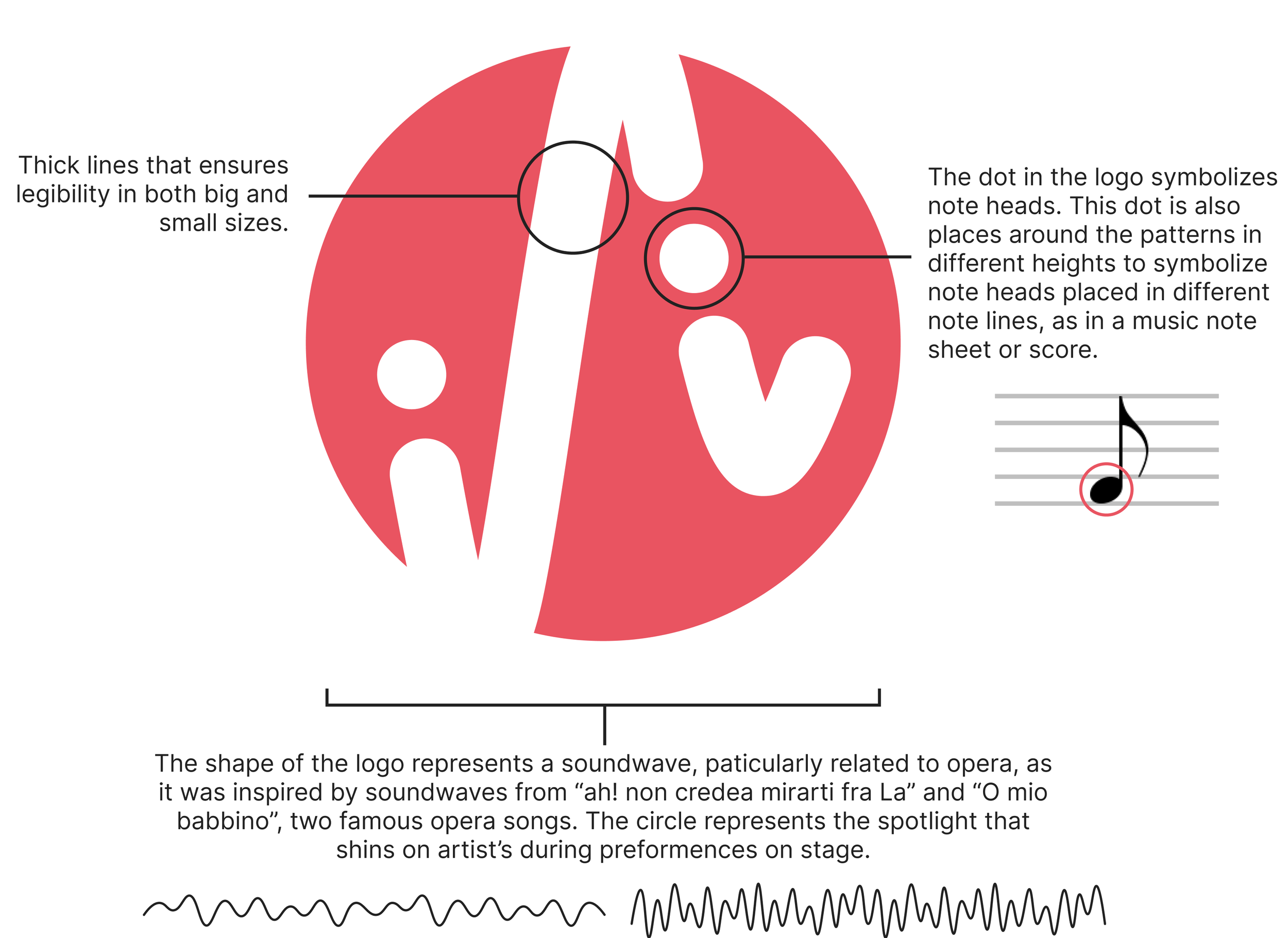
Building on the concept of sound waves, this logo feature a wave and a diamond crown in the shape of diamonds. Here, the wave represents music, and the crown represents the competitions royal connection, Queen Sonja.
Concept 2
This logo resembles an emblem, where the competition name is enclosed in a window shaped border, connected by diamonds. This design was discarded for further development, as digitalizing made us realize that it would not work in smaller sizes, and would therefor not be fit as a logo.

Concept 3
The concept of this logo builds on combinging the first letters of “Queen” and “Sonja” into a logo mark. Using a font styled like handwritten caligraphy, the letter “Q” appears with the letter “S” intertwined.

Further Development
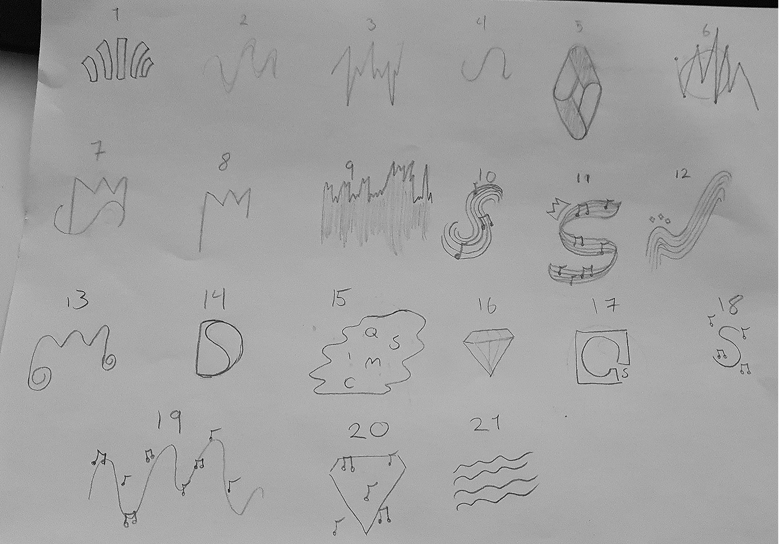
Taking the design further, many variations was created and user-tested. Through user-testing, asking a collection of people from within the target audience, we recieved feedback about their associations to the different design variations. Based of this feedback, we realized that the current wave shape needed to be altered to better convay the symbolizm of a sound wave. Further design iterations were created, using the basic wave shape as baseline.
Design Iterations
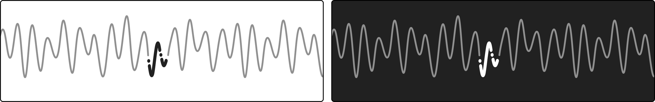
The first sketch feature a wave with a crown, meant to reflect the competitions name and host, queen Sonja. Further iterations played more into the wave shape, adding dots in the line path to symbolize the different notes in a notes sheet.

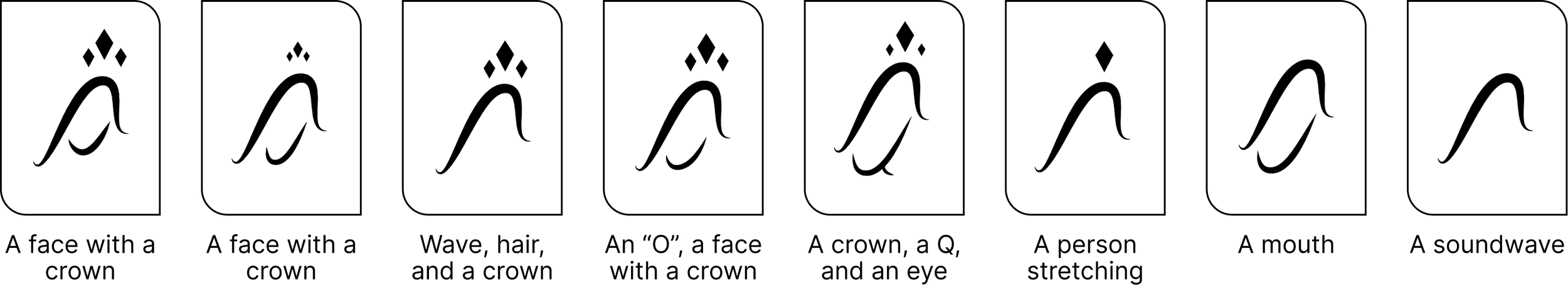
To further this concept, sound waves from two real opera songs were used to map a more dynamic shape for the sound wave. Using this new dynamic shape, dots were again added to symbolize notes in a music notes sheet, and lines were thickend for legibility.
VISUAL IDENTITY
The identity was developed through frequent exploration, design iterations, and user feedback. The following section highlight the final logo design, color palette, typography, and identity pattern.
Logo Mark
The logo mark embody the identity concept.
Logo Variations & Clearspace
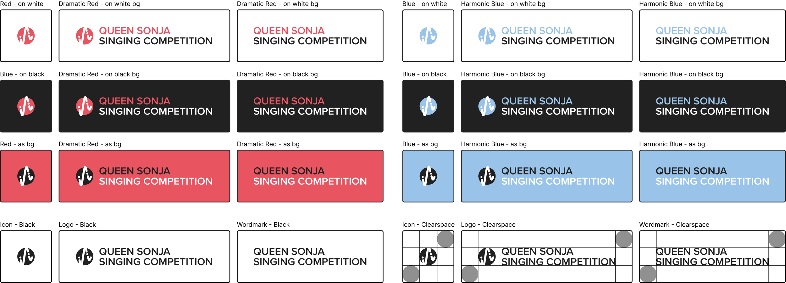
To ensure versitility, the logo was created in three variations: (1) full, (2) wordmark, (3) icon. The image below showcase these different logo variations, including the application of color and how the logo should be used when colors are applied. Each variation should also always have a minimum amount of clearspace equalling the diameter the icon circle.
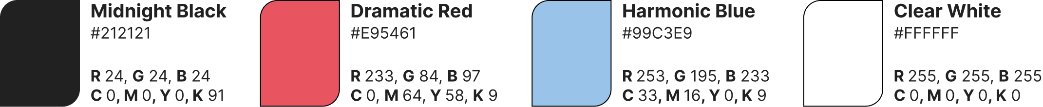
Color Palette
Strong and bold colors are prominant, providing the identity with a highly modern expression. The palette consist of two identity colors, dramatic red and harmonic blue, which each represent the vocal range of singers. Red represent the powerfull high notes, and blue represent the deep low notes. These two colors also provide the identity with a visual balance, especially related to warm and cold color contrasts.
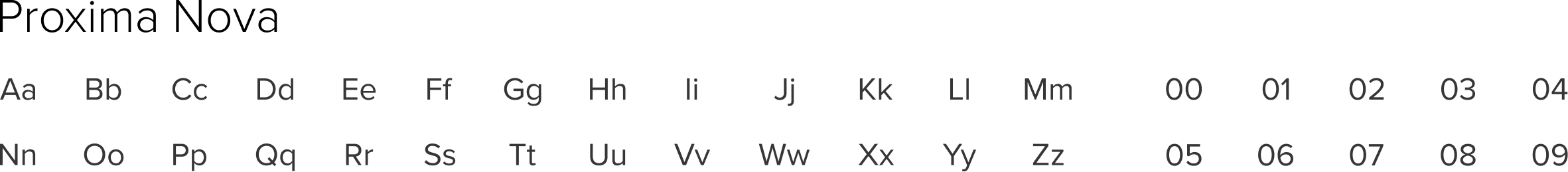
Typography
Proxima Nova is the only font used in this identity, utilized in regular, bold, and extra bold weight.
Proxima Nova is a geometrical and modern typeface that provide the identity with a bold expression that appeal to a younger audience.
Pattern
The identity also feature two sound wave patterns, made work as captivating visual elements that provide variations and versitility. The patterns correspond with the identity colors, representing artist’s vocal range. Dramatic red is featured on the pattern that represent the powerfull high notes, and harmonic blue is featured on the pattern representing the deep low notes.
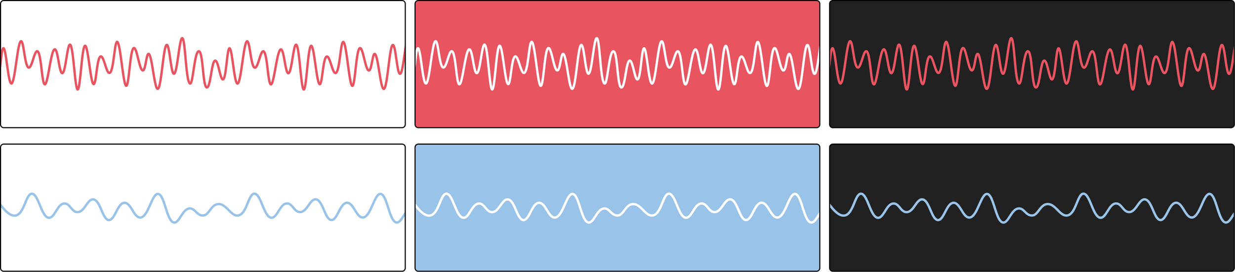
Strengthening the message and concept of sound waves in the identity, the logo shape was taken out of the dramatic pattern, shown in Dramatic Red.
TOUCHPOINTS
In this project, we were tasked with creating varity of key visuals for different media and formats. The following section showcase all these different designs, including business cards, social media graphics, banners, website, merch, and event tickets.
Posters
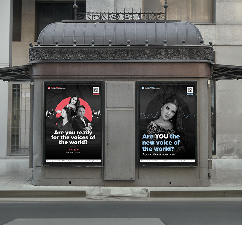
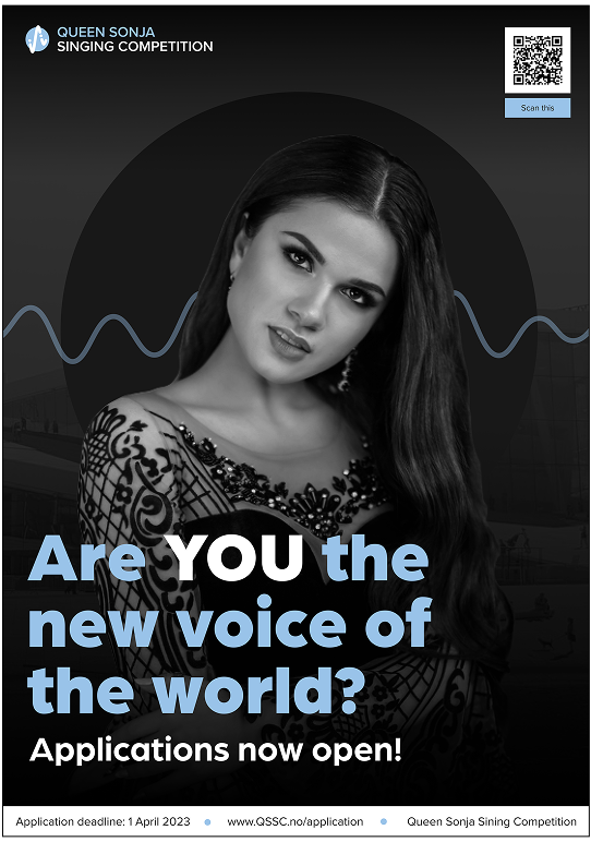
Two poster designs were created to advertise the competition in physical spaces: one aimed at participants and displayed before and during auditions, and another aimed at audiences, displayed ahead of the event to promote the competition and attract attendees.
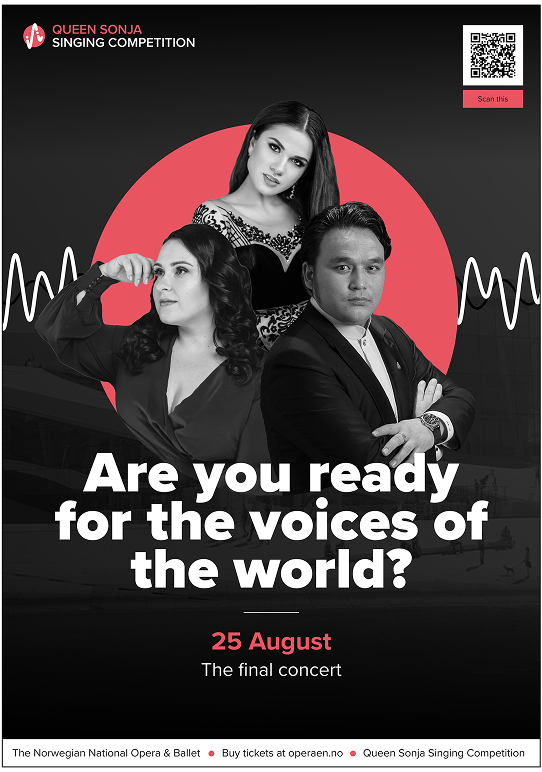
Posters directed at the audience- made to advertise the singing competition in real world environments.
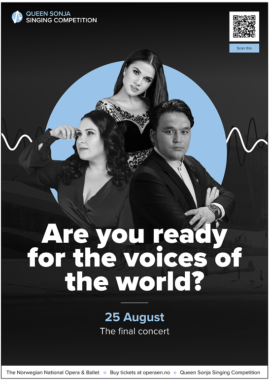
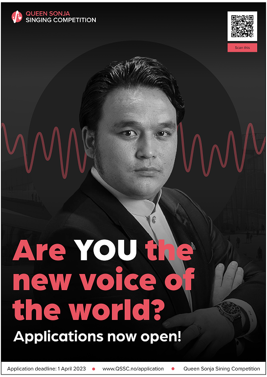
Posters directed at participants- made to advertise the singing competition in real world environments.
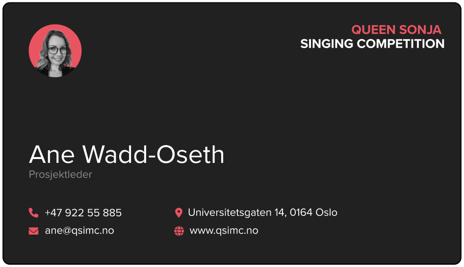
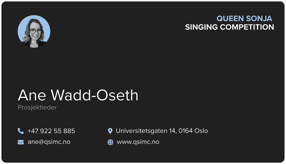
Business Cards
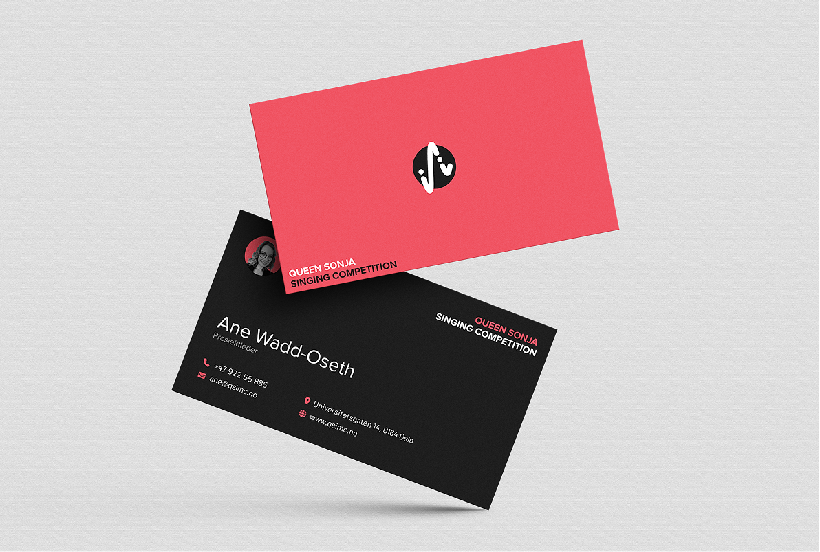
Two designes of the business card were made to reflect different relationships to the competition: the red cards are intended for those closely involved in the event, while the blue cards are for more external contacts such as sponsors and partners.
The cards in Dramatic Red is intended for those closely involved in the event.
The cards in Harmonic Blue is intended for more external contacts such as sponsors and partners.
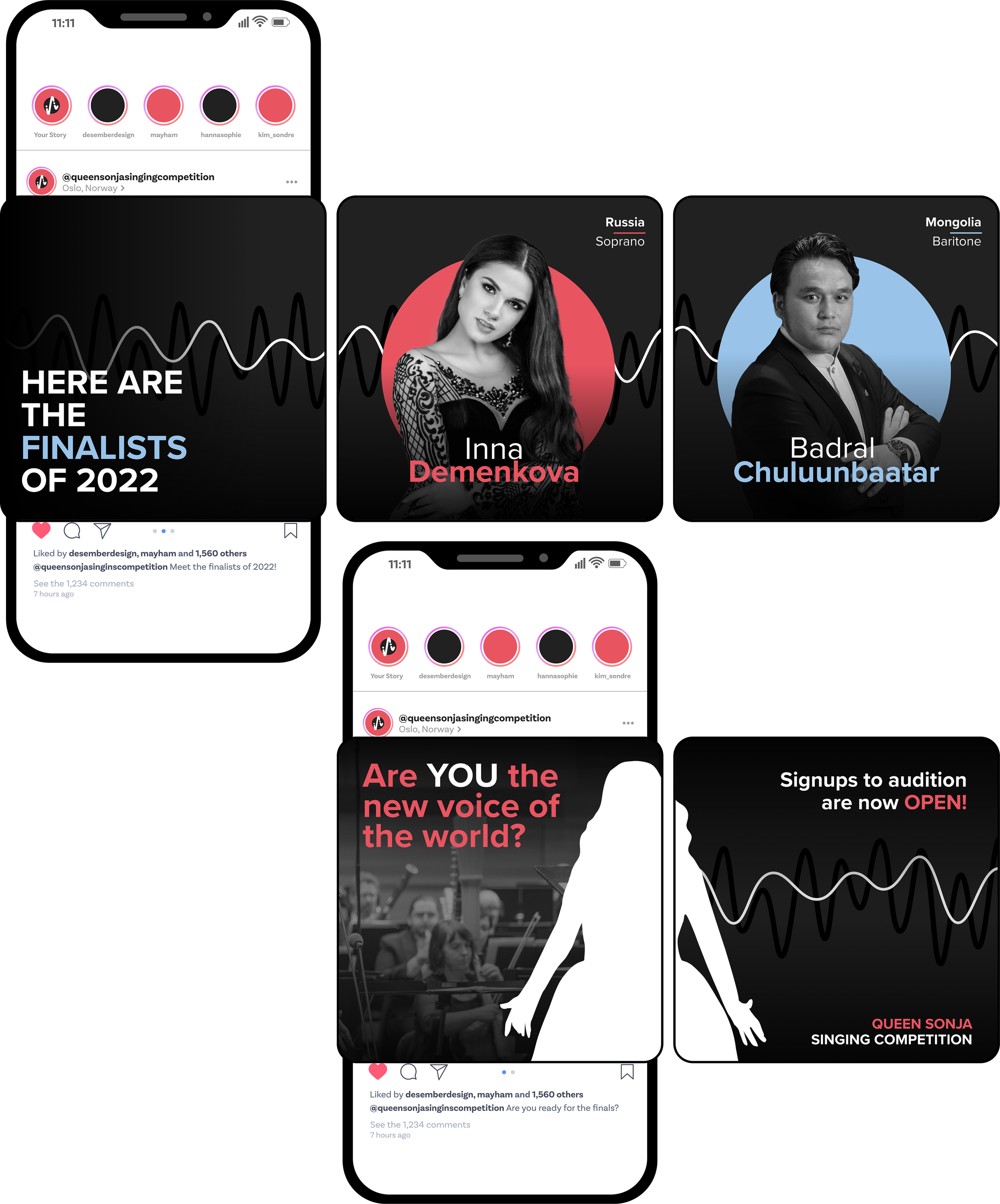
Social Media
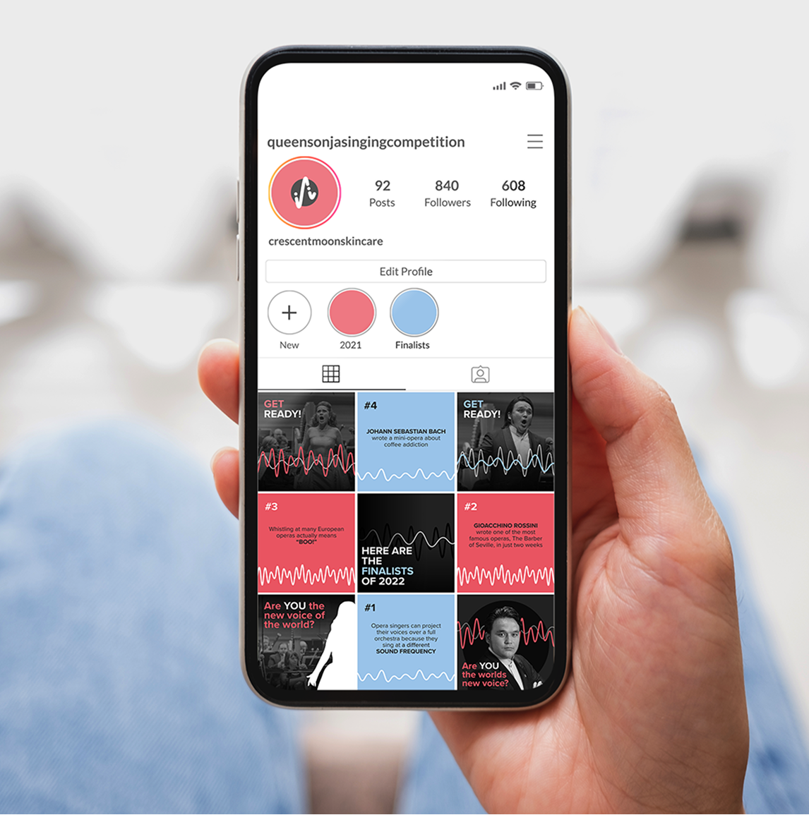
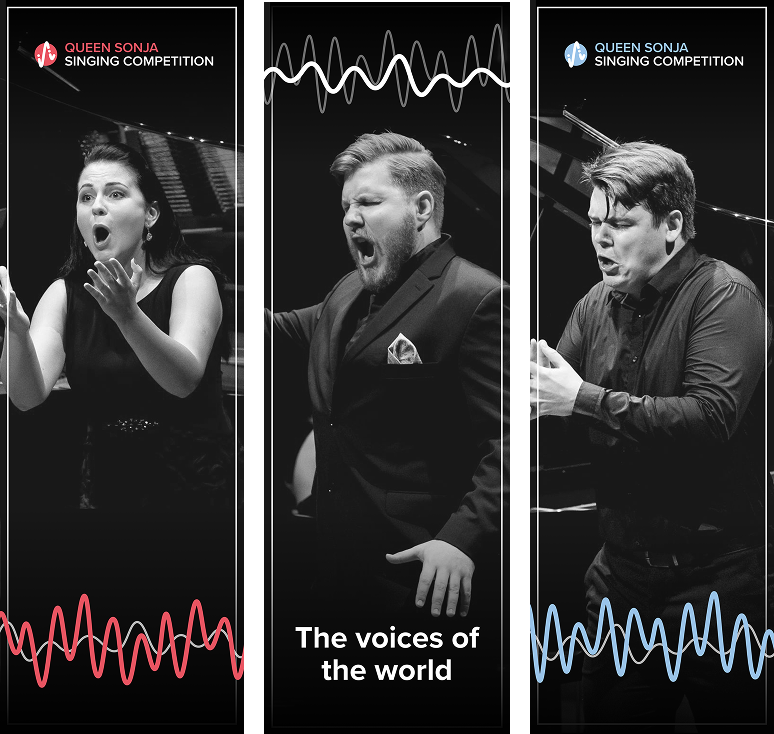
A series of social media graphics was also created for the competition’s Instagram page, including both standalone posts and posts designed to be shared as cohesive multi-image series.
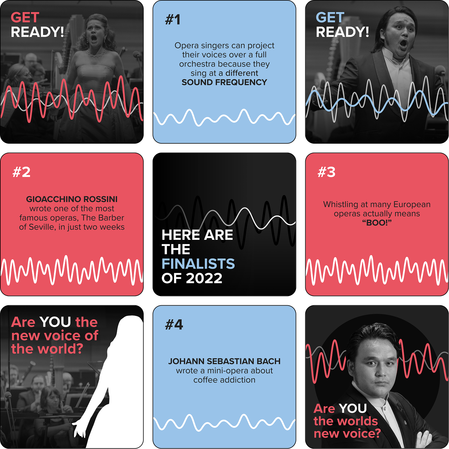
A collection of graphics made for the competitions Instagram page
Graphics meant to be posted as a scrollable slideshow
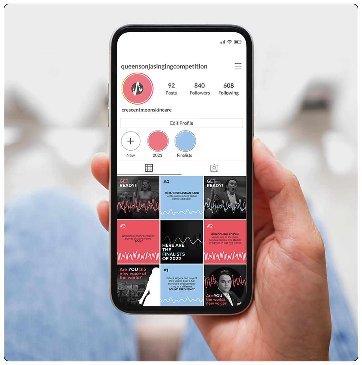
Mockup of the competitions Instagram page
Banner
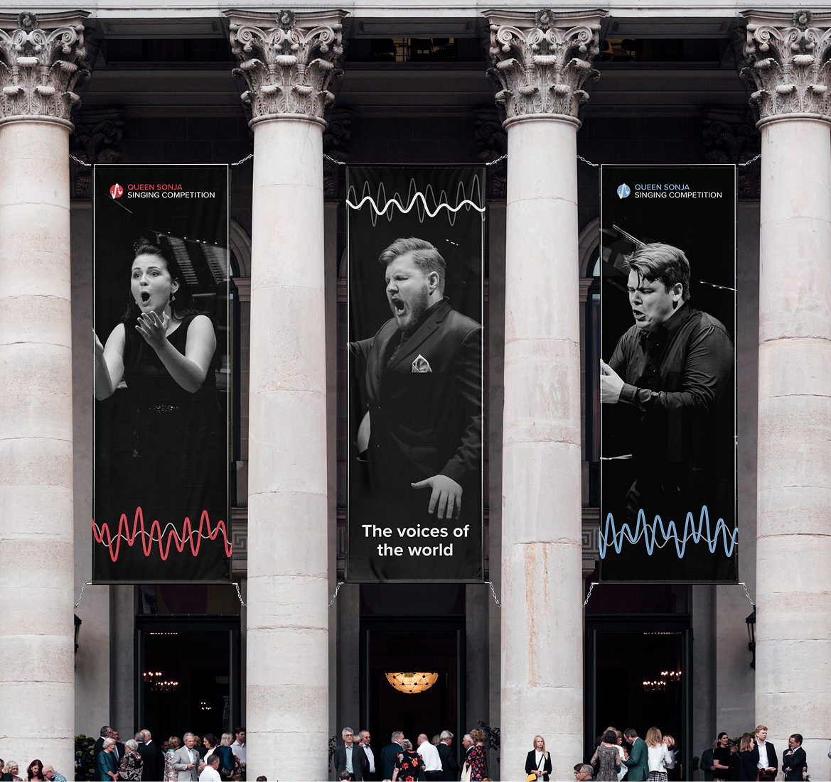
A three-section banner was designed to hang outside the venue, serving both as pre-event advertising and as on-site signage during the competition, as well as being displayed around the city to promote the event.
A collection of banners designed to hang outside the event avenue and in the streets to advertise the competition
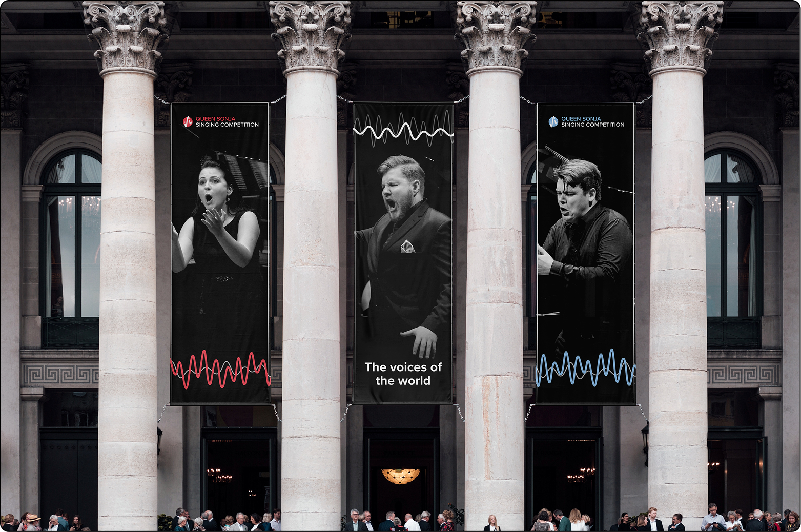
Mockup of the banners in a real world environment
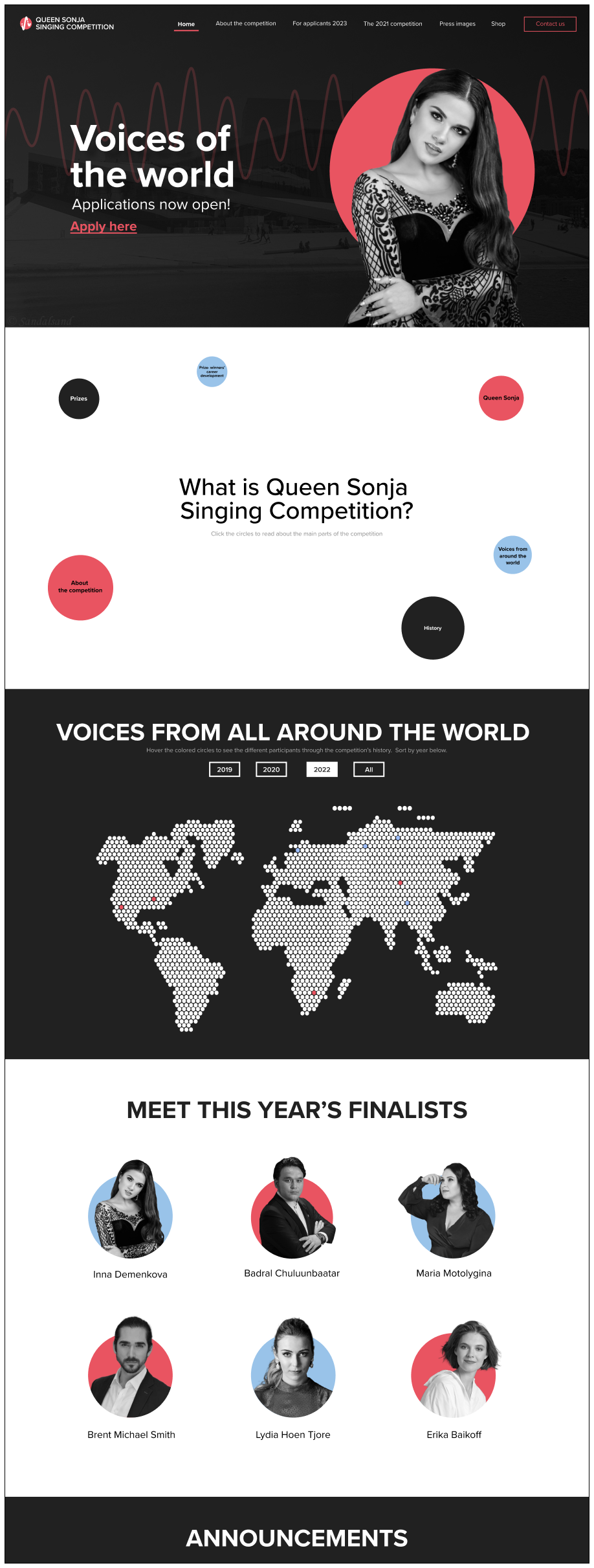
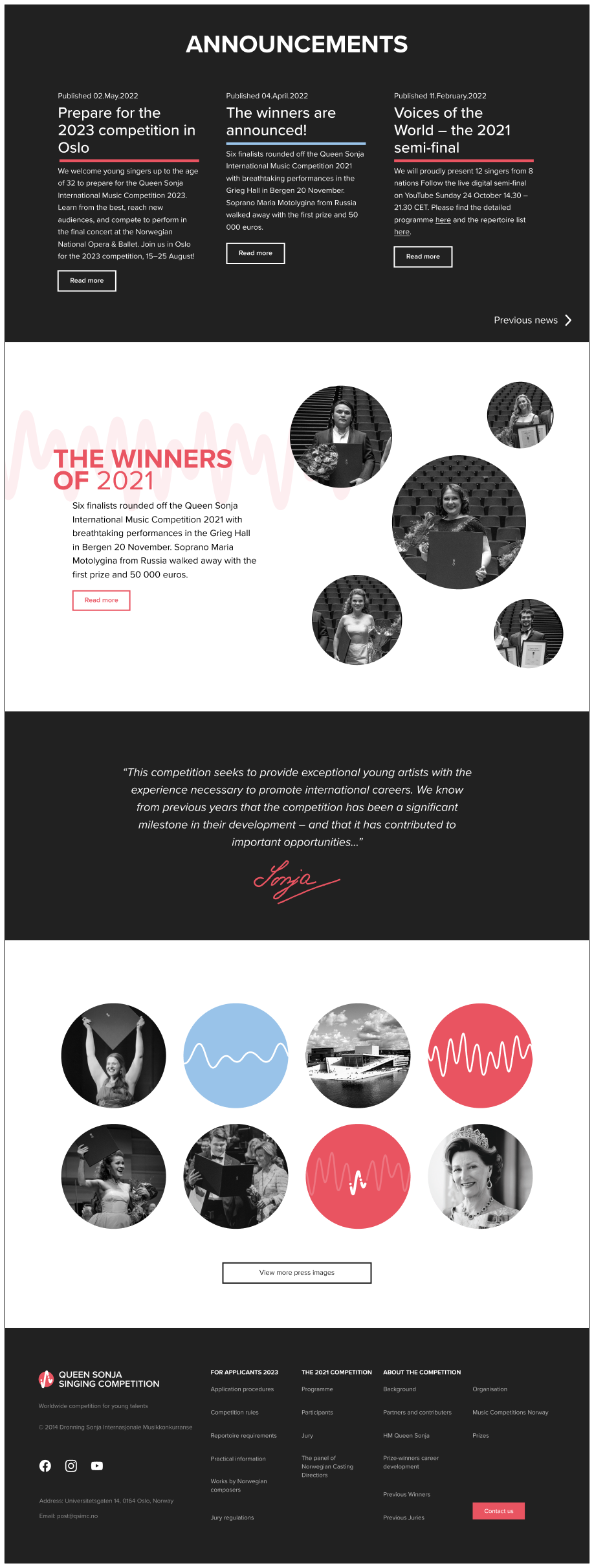
Website
A website landing page design was also created, utilizing and expanding on the identities visual expression across different platforms. The website highlight how colors should be utilized, how images should be displayed, and how content should be structured.
Tote Bag
A tote bag merch design, meant to be handed out to attendees who purchased tickets and attended the competition in person.
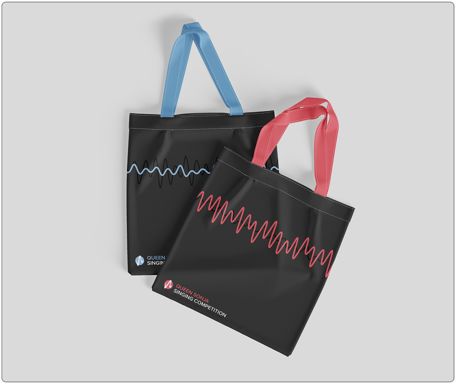
Mockup of tote bag designs, serving as competition merch.
Event Ticket
A ticket design was created for audience members, aligning with the competition’s visual identity while clearly communicating essential event information and enhancing the overall attendee experience.
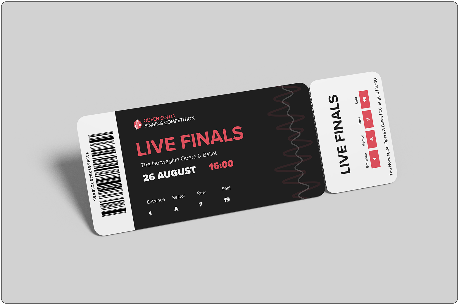
Custom event ticket design, made for the audience who attend the competition