LOGO DESIGN
Clinet Work for Sakura Jenny

Clinet Work
— for Sakura Jenny
Software and Tools
— Adobe Illustrator
Year
— 2023
PROJECT
I was commissioned to create a logo that would represent the client as a content creator and streamer. This logo was to be used in digital content, such as on stream overlays and in Youtube and Tiktok content.
About the Client
Mission
— The following mission statements were emphasised in the development of this visual identity: (1) Identify the best young singers from around the world, (2) Give all participants international exposure, (3) Inspire and enrich the lives of its audiences through exceptional performances and exposure to the power of the human voice, (4) Engage with streaming services to reach hundreds of thousands of people worldwide.
Vision
— Their vision revolves around being a world-renowned, leading international singing competition that transforms the careers of young singers, bringing the power of the human voice to the modern world.
Values
— The following four key values were identified in our research: (1) the transformative impact of human voices, (2) partnership, (3) leadership, (4) increase visibility.
LOGO
The logo was created by taking inspiration from the clients persona and character design.
Logo Design
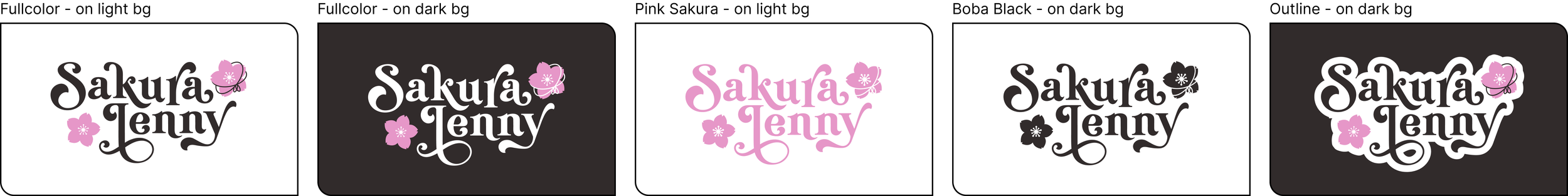
The logo was designed to match the clients streaming persona, taking inspiration from their character design. The sakura flowers reflect both the clients name and character design, as the clients character feature a lot of pink flowers. The same goes for the string enclosing the flower in the top right, directly inspired by the string featured across the character design.
Logo Variations
The logo was made in one layout variation, as requested by the client. Below is a guide on how the logo should be used in relation to logo color and background color. A variation with an outline was also included to ensure versitility.
Clearspace
Here is a guide of the minimum amount of air the logo should have when placed in media. Due to how far down the letter “J” goes, the clears pace from the bottom is counted from the lowest point of the letter “Y”. This is to ensure that the logo appears centered when placed based on the defined clears pace.
Color Palette
To ensure versitility, the logo was created in three variations: (1) full, (2) wordmark, (3) icon. The image below showcase these different logo variations, including the application of color and how the logo should be used when colors are applied.

Typography
Delightful Napkin